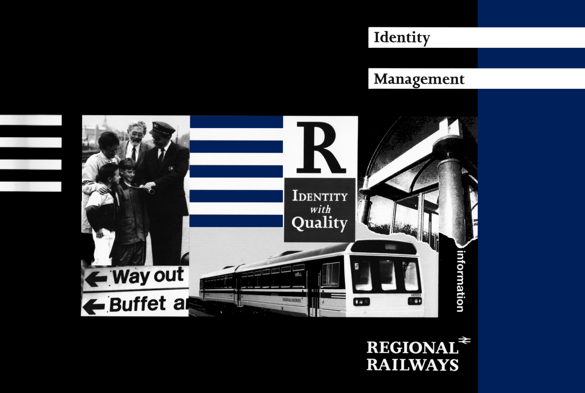
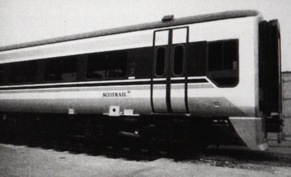
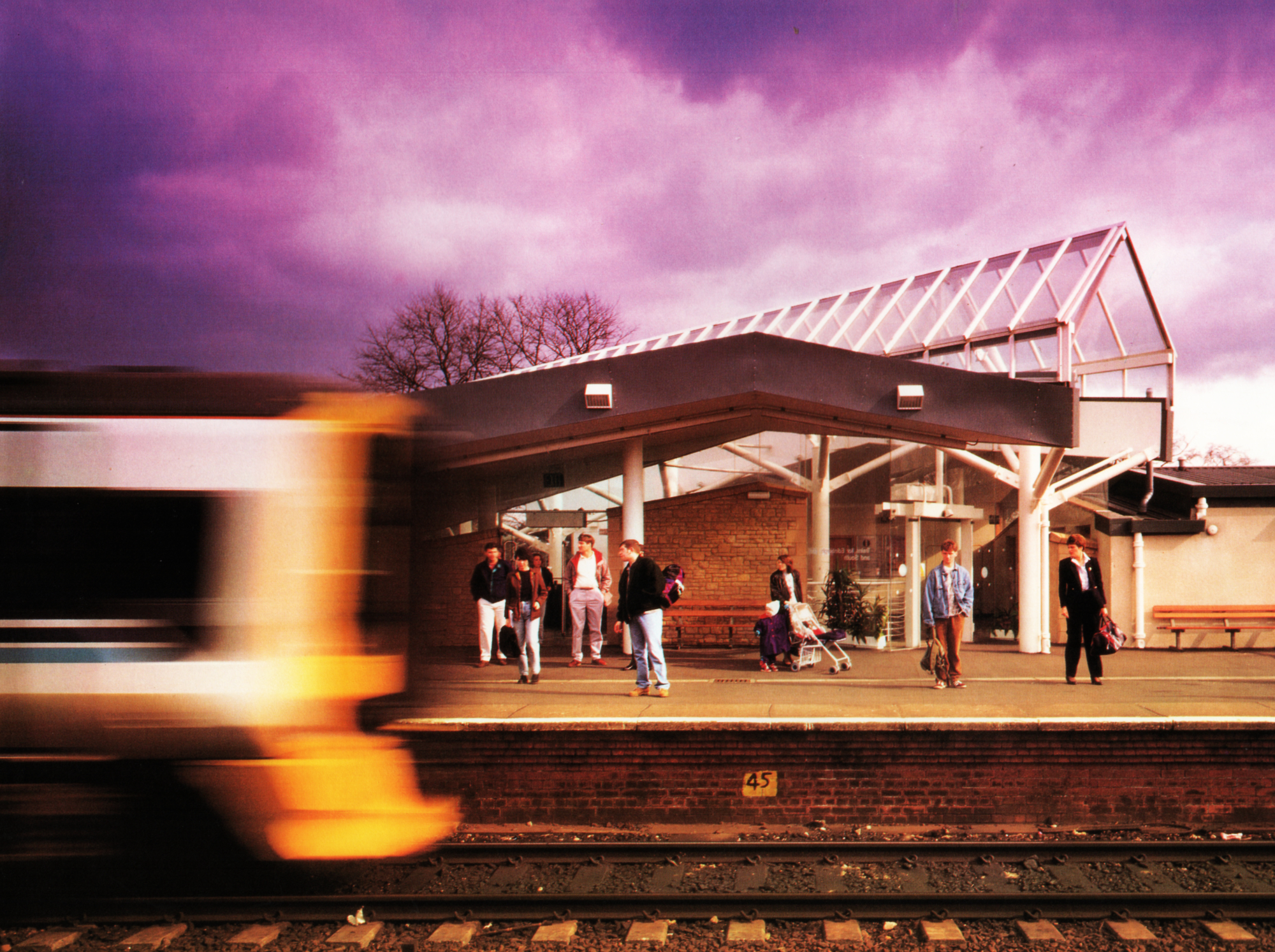
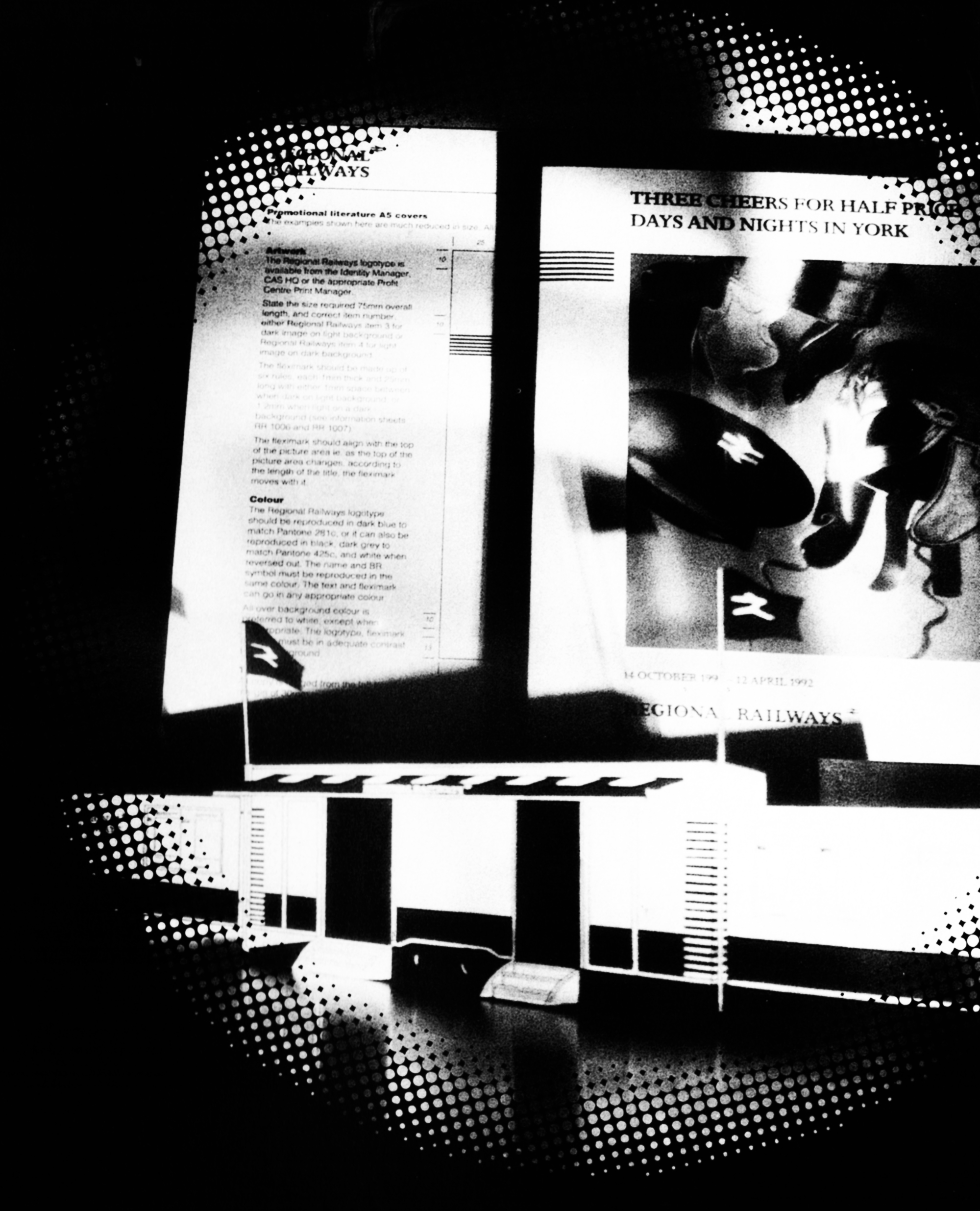
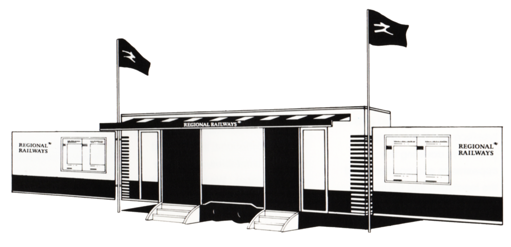
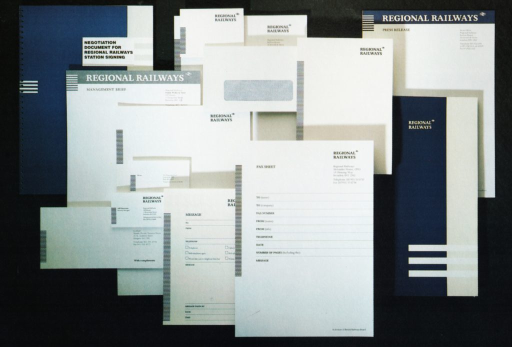
Stationery range
We recognise that good stationery reflects an image of quality on the company that uses it and one of the main requirements of good stationery is that it should be easy and convenient to use.
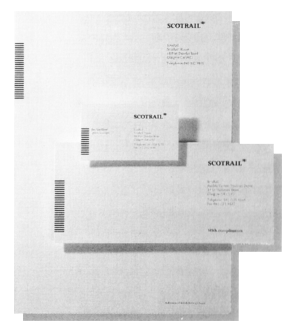
The range of stationery designed for Regional Railways comprises letterheads, compliment slips, business cards, envelopes, headed paper (for internal correspondence or continuation pages for external letters or reports), fax header sheets, memo and telephone message pads, adhesive desk memo pads, window covers for internal documentation and folders.
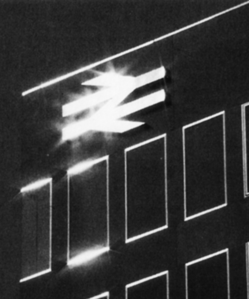
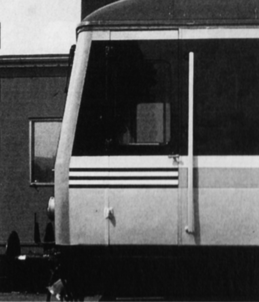
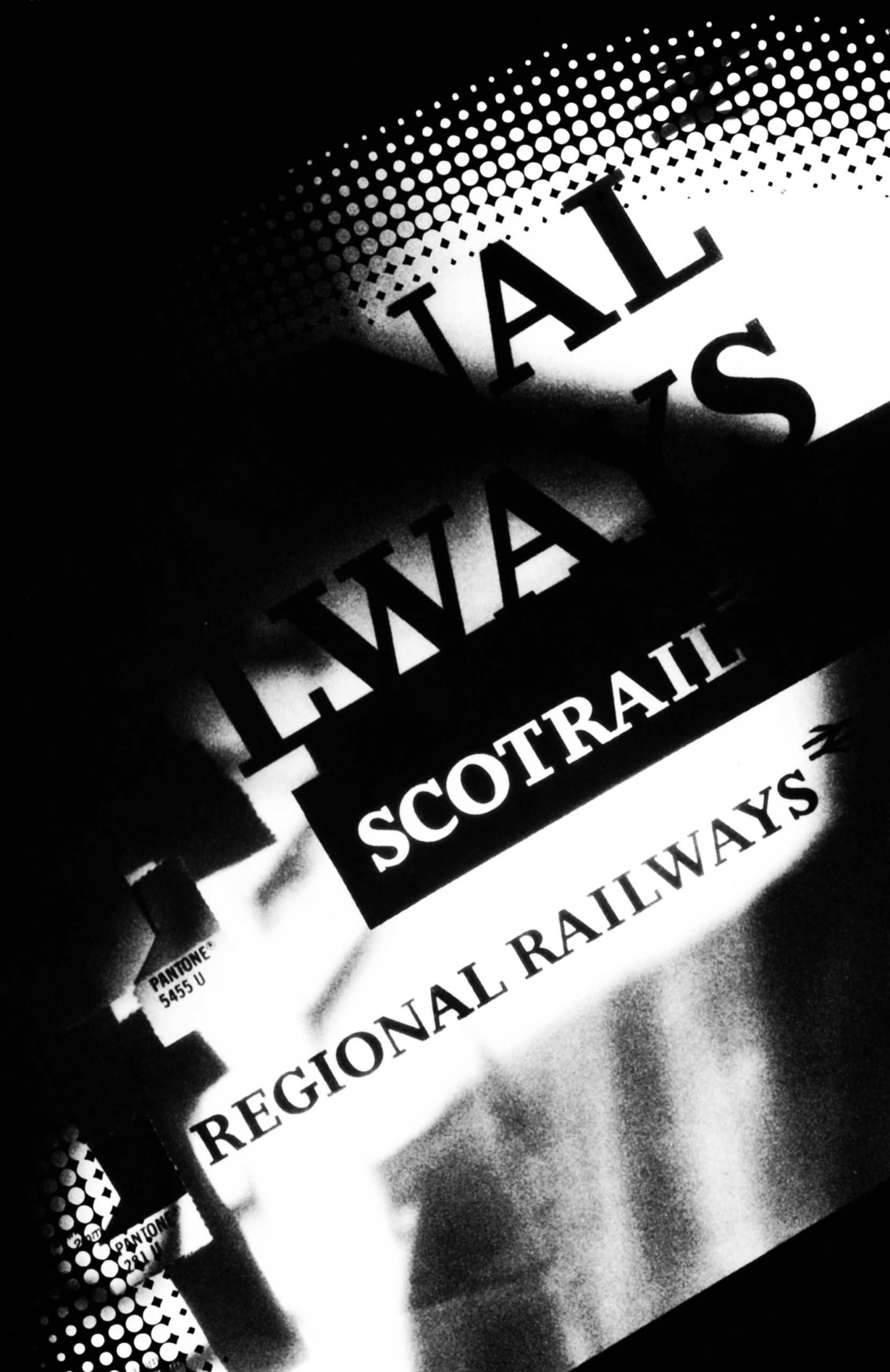
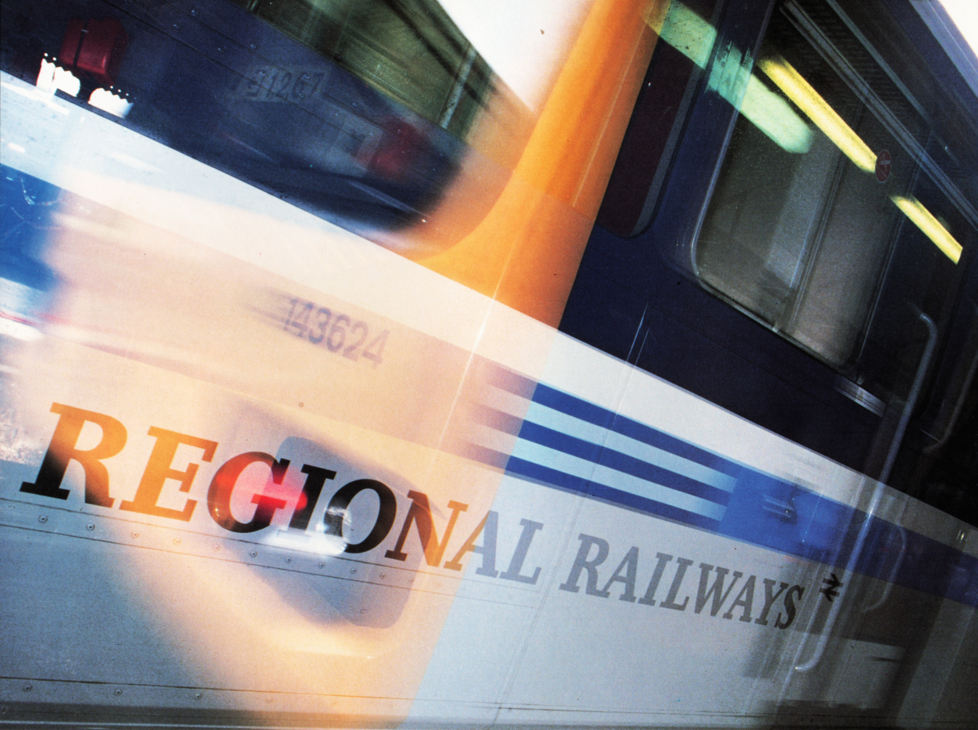
All items feature the fleximark, the Regional Railways or ScotRail logotype and the main house colour, Regional Railways dark blue. The use of each item was carefully investigated before the design was chosen.
Paper quality
Appropriate paper is a valuable method of projecting a quality image. For external letterheads Conqueror brilliant white wove 100 gsm has been chosen. The headed paper for use with internal correspondence and as continuation sheets for external letters is less expensive while still visually matching Conqueror.
Cost effective paper has also been chosen for items such as memo and message pads. The type of paper is carefully matched to the item’s function; for example, fax header sheets which use non-slip paper of the correct weight for fax machines.
Stationery contracts are awarded on the basis of quality and cost by the Director of Procurement. When the contracts come up for renewal the paper will be reviewed. It is intended that Regional Railways will switch to recycled paper when the quality and price are acceptable.
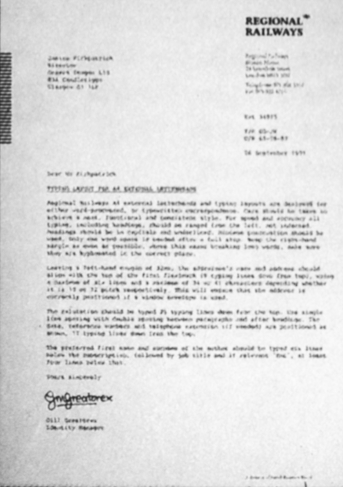
Typing layouts
The design of stationery does not begin and end with the printed logotype. An appropriate typing layout provides the final element of the overall design and adds up to a total quality image in the hands of the recipient, whether inside or outside Regional Railways.
The typing layout is also designed to make life simpler for the people who have to produce the letters. A briefing session for Regional Railways secretarial staff produced valuable input which has enabled us to produce an improved layout that can cope with such aspects as long reference numbers.
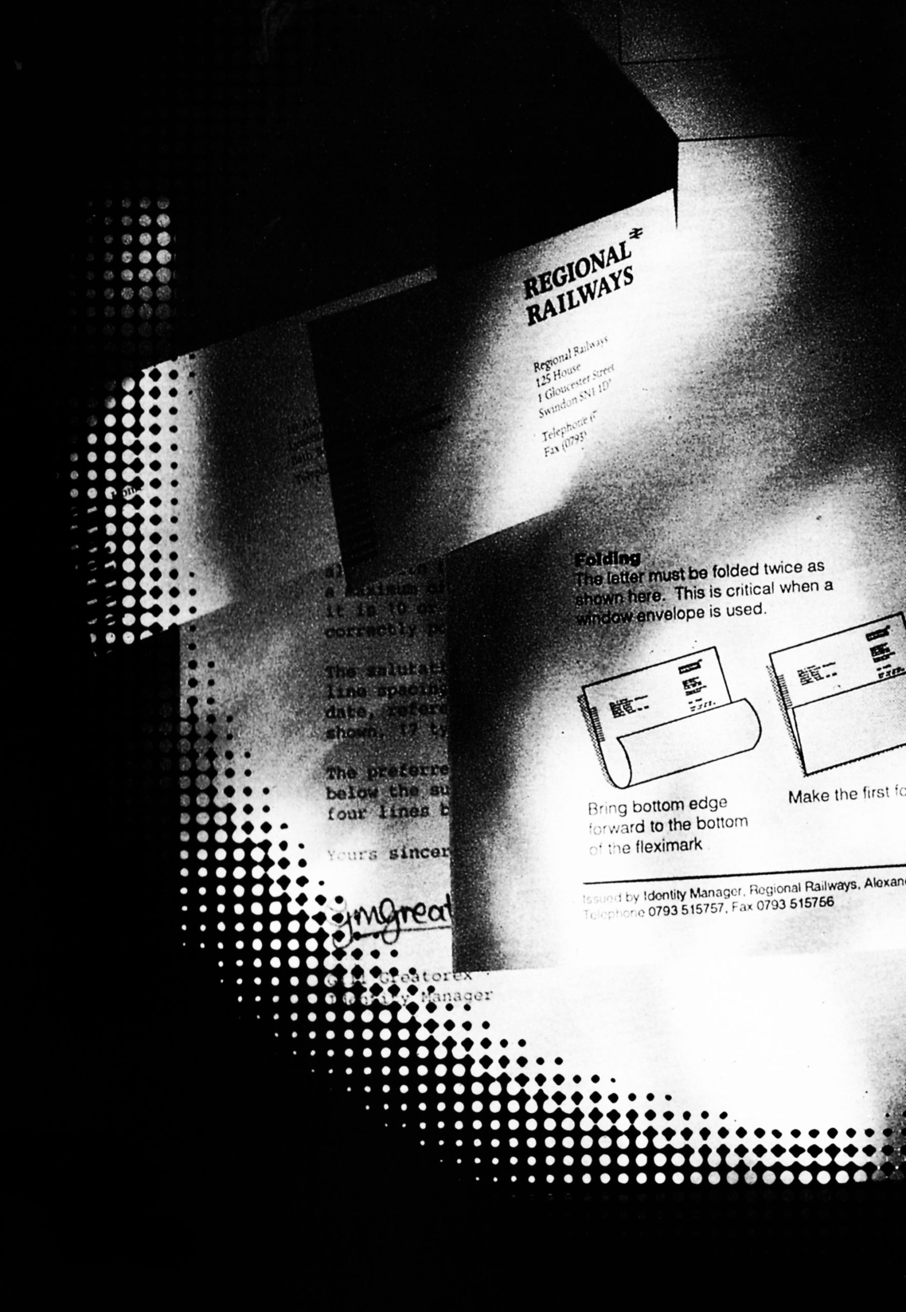
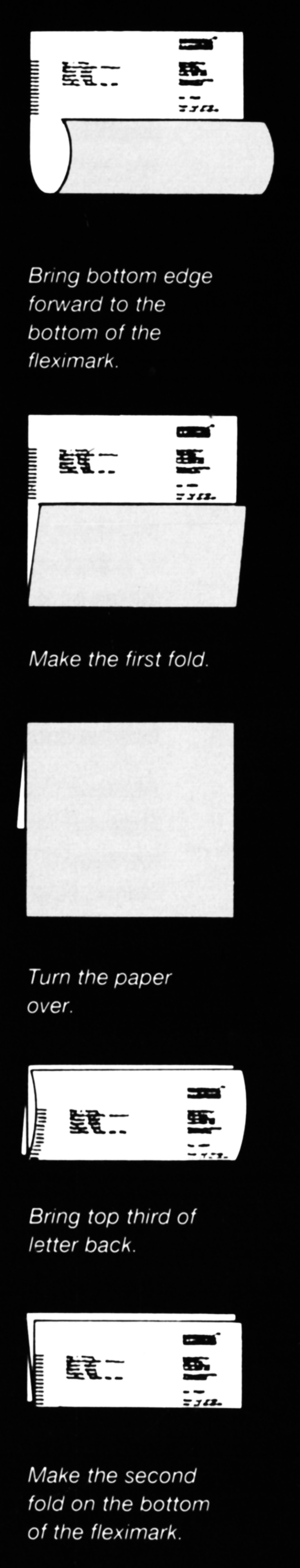
Information sheets in the Identity Management binder cover typing layouts for internal and external letters. For copies of the typing layouts and letter folding instructions please get in touch with your profit centre stationery contact who can be found in the Contacts pages of this brochure.
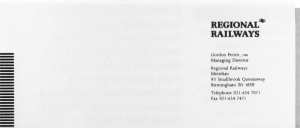
Letterheads/compliment slips
There is a standard formula for printing addresses on letterheads and compliment slips. The first line holds the approved department name, if required, followed on separate lines by the name of the business (Regional Railways or ScotRail), the profit centre name if appropriate and finally the full external address. Profit centre names (Central, North East, North West, ScotRail, South Wales & West) and HQ Engineering functions in Derby (Mechanical & Electrical Engineering, Traction & Rolling Stock Engineering) are printed in bold.
The Regional Railways Executive Group have agreed that there will be no personalised stationery other than that for the Managing Director and profit centre Directors. The description ‘personalised stationery’ includes addresses beginning with titles such as ‘Civil Engineer’ or ‘Retail Manager’ rather than ‘Civil Engineering’ or ‘Retail, and as such will not be acceptable.
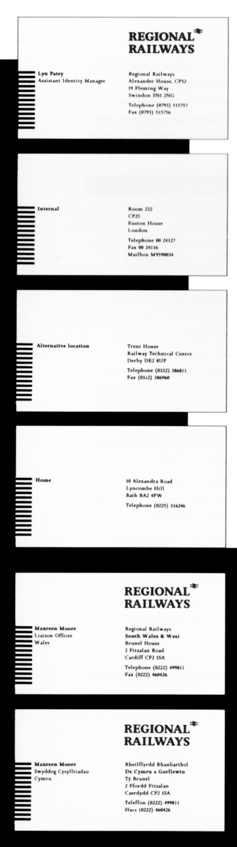
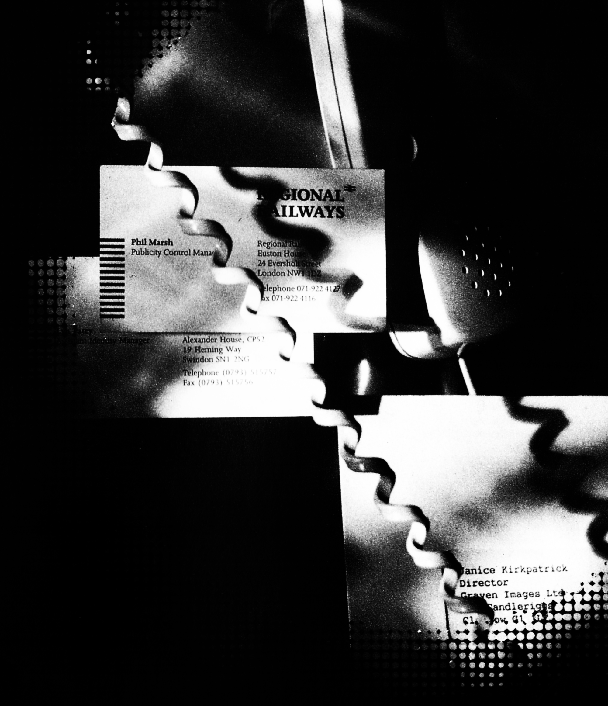
Business cards
Regional Railways is the first sector to recognise that there are two audiences for business cards; audiences outside British Rail and BR staff external to Regional Railways. Accordingly the front of the business card has only external information while there is provision on the back for internal information such as CP numbers, BR telephone numbers and micromail. Internal and external information should not be mixed.
As an alternative to internal information it is possible to have a home address or alternative location on the back of the card. Staff in Wales may have double-sided cards; Welsh on one side, English on the other.
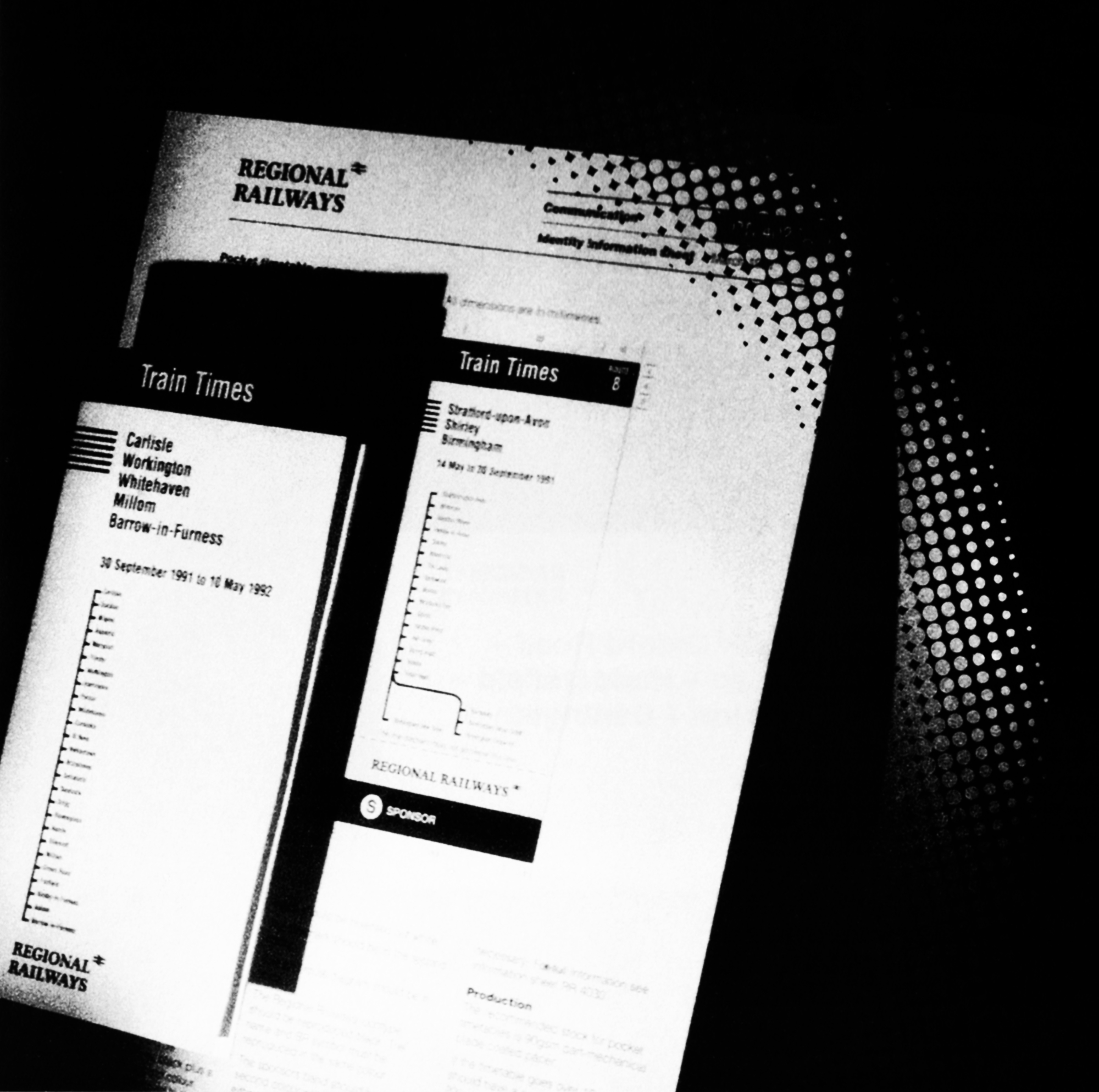
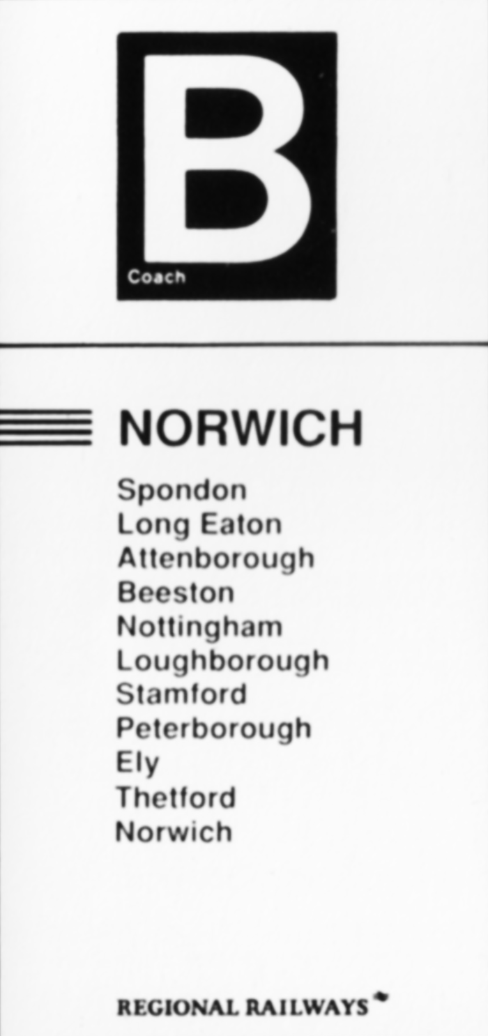
Continuous stationery
This is available through McVicars Printers, Glasgow. The design is exactly the same as for ordinary letterheads and headed paper.
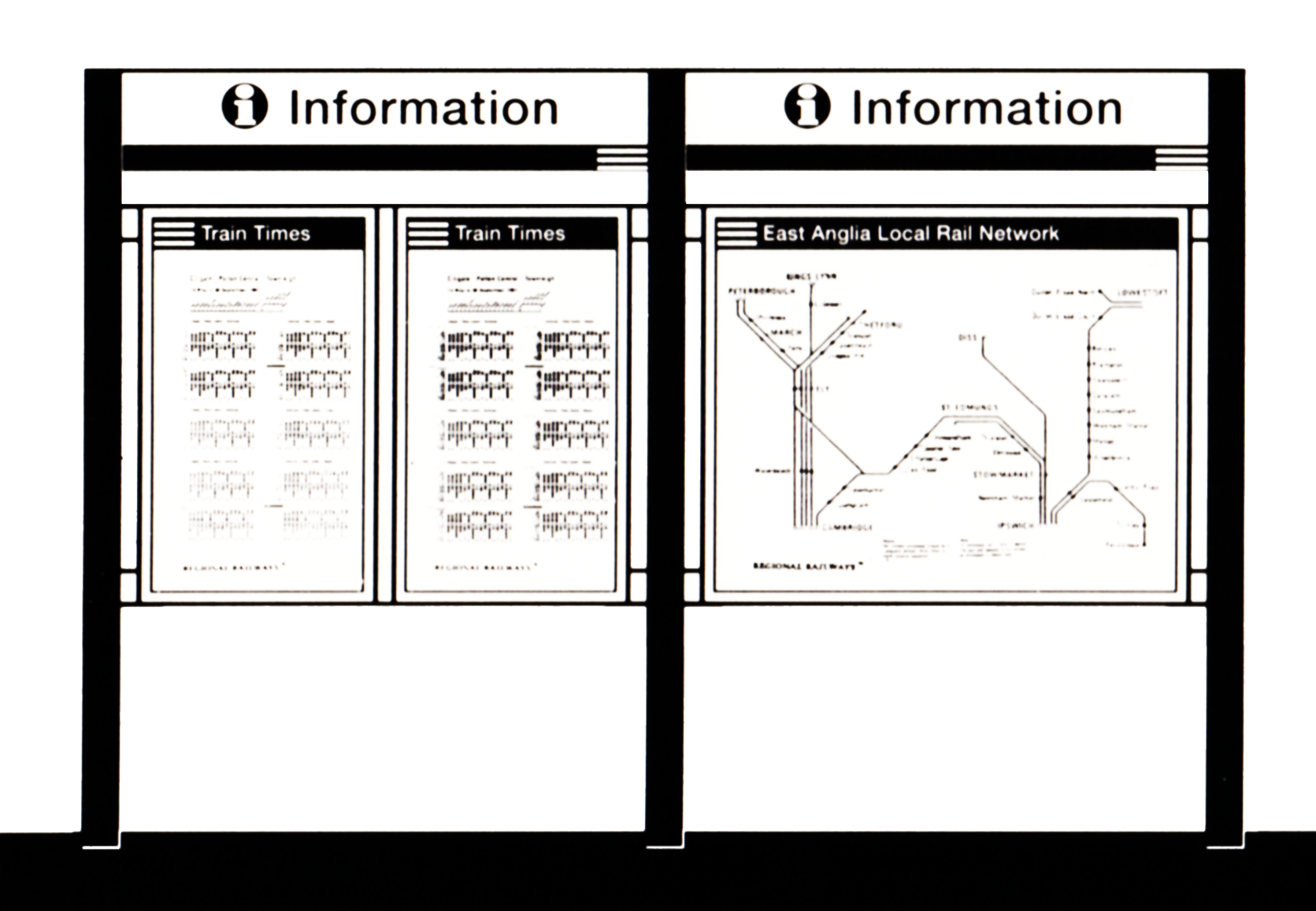
Internal documents
Layouts have been created for a range of internal document covers. They comprise single sheets with and without windows, folded covers with and without spines and encapsulated ring binders. All feature the fleximark, Regional Railways or ScotRail logotype and the house colours of dark blue and silver grey.
Ordering procedure
Pocket folders, adhesive memo pads and all internal documentation covers, apart from window covers, are available through the Senior Advertising Manager, London or your profit centre Print Manager. Window covers are ordered direct from Willsons Printers. All other stationery items are available on call-off contracts currently held by Willsons Printers, Newark, and by J.McVicars Printers, Glasgow, The addresses and telephone numbers can be found in the Contacts section of this brochure. Copies of the contracts are available from the Director of Procurement.
Specially prepared order forms are available and should be obtained from your HQ or profit centre stationery contact. Once filled in the forms may be sent direct to the printers. Any queries regarding stationery should be addressed to the profit centre stationery contact or the Assistant Identity Manager.