
For best results, view in landscape.

For best results, view in landscape.

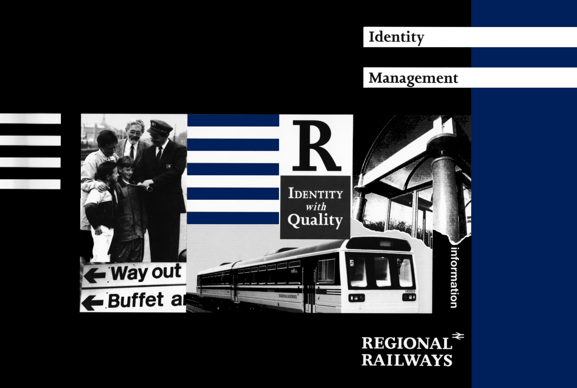
The Regional Railways corporate identity scheme tends quite deliberately towards restraint and understatement, a hallmark of quality in any walk of life. It accommodates local architectural and environmental characteristics. But make no mistake, flexibility is built into the scheme. The scheme itself must be applied rigorously if it is to achieve its proper impact.
And that means paying attention to detail, whether it is a question of using the right local material to restore a station building or simply developing a reputation for being a network whose stations are always swept clean, whose facilities always work.
Getting those things right requires constant effort but it also develops a real sense of satisfaction in everyone involved. It’s a little like putting on a play, but a play with a lifetime of opening nights and a vast audience comprising not only our customers but also other people within the business. Getting things ‘right on the night’ is the goal. To achieve it will be tremendously rewarding, on a personal as well as a business level.
The core of the new Regional Railways corporate identity scheme is contained in the Identity Management binder, a copy of which should be accessible to anyone who has any responsibility for implementing any part of the identity. It contains individual information sheets, each dealing with one specific aspect of the identity, or one part of one specific aspect. Because a corporate identity is never static, the information sheets are updated and added to as the need arises.
Both the binder and this brochure contain lists of contacts who will be able to assist with any queries or problems relating to particular aspects of the identity. Queries on general aspects of the identity should go to the Identity Manager who is also on the list of contacts.
Our aim is to provide, with the aid of the Identity Management Binder and this brochure, totally clear and unambiguous instructions on how to put the corporate identity into practice. And putting it into practice is a matter of obligation. It is not an option.
design elements
The new name, Regional Railways, says precisely what the business is. The logotype is a combination of the name – in a bold, serifed, upper case development of the Joanna typeface – and the British Rail symbol. The close association between the two, the size and position of the one vis-a-vis the other, makes a clear statement about the relationship between them. Regional Railways is in the driving seat but is proud to associate itself with all the best qualities of its parent organisation.
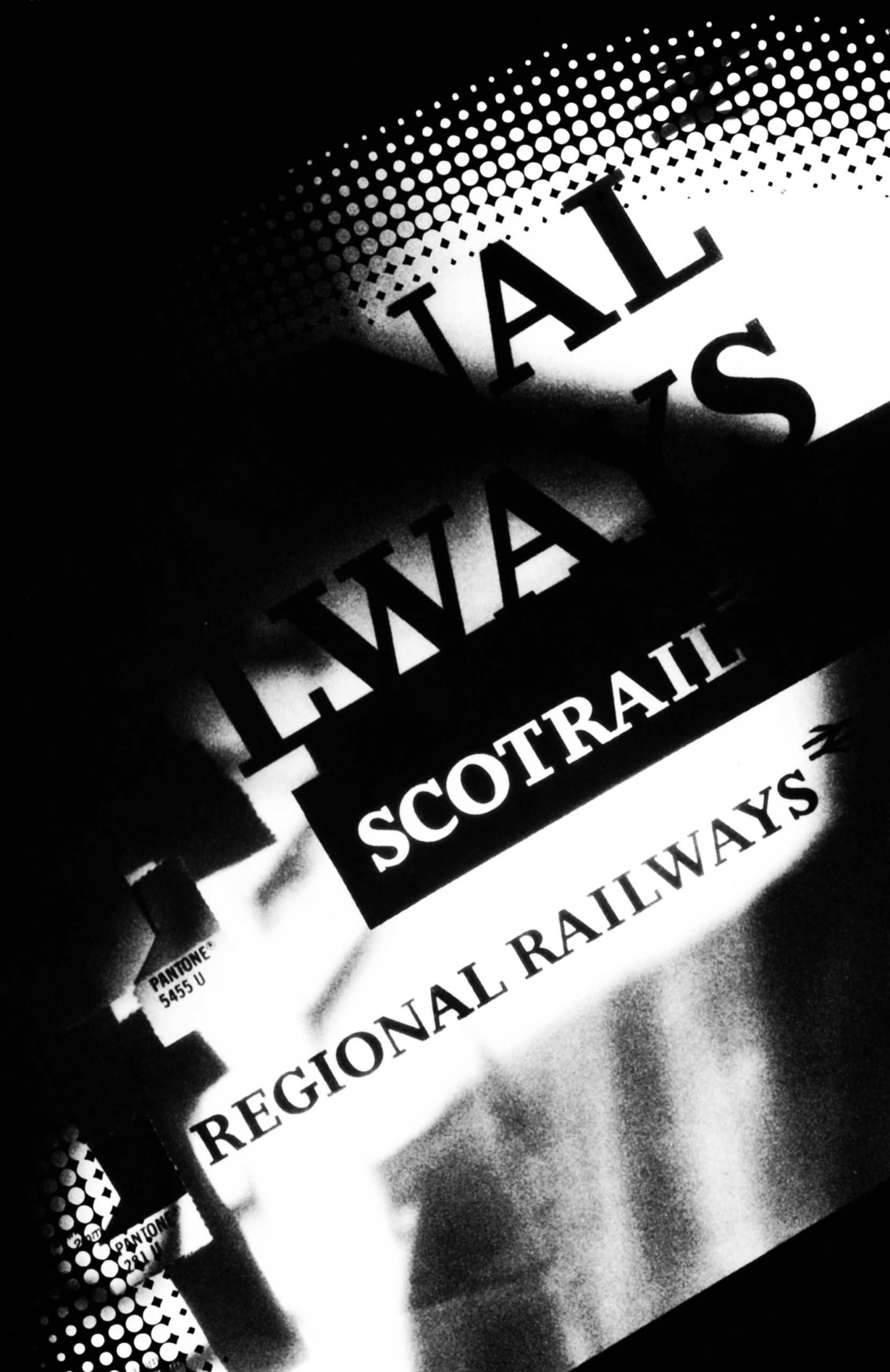
ScotRail is the only one of the five Regional Railways profit centres that has a separate logotype. The reason is primarily one of geography. It operates in an area that is virtually self-contained, with relatively little traffic between it and neighbouring regions. ScotRail has built up a good reputation over many years and its name has acquired excellent connotations in the eyes of its customers. It would not have been sensible to abandon this asset. So, putting it simply, Regional Railways trades as “Regional Railways” in England and Wales, and “ScotRail” in Scotland.
The house colours remain, as before, dark blue and grey but the colours will be richer and have more depth. The designers have ensured that a particular colour will appear the same on large surface areas, such as rolling stock, as on small items, such as printed documents. Colours appear paler on large areas so adjustments have to be made according to the scale of the painted or printed object.
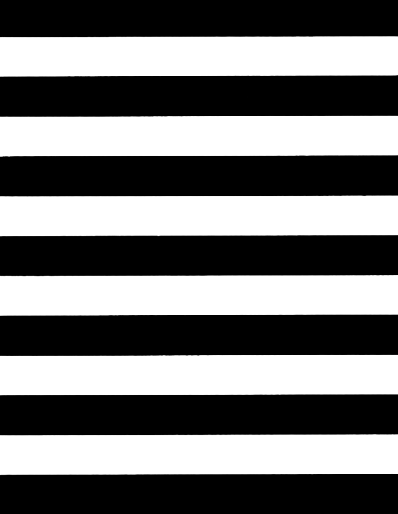
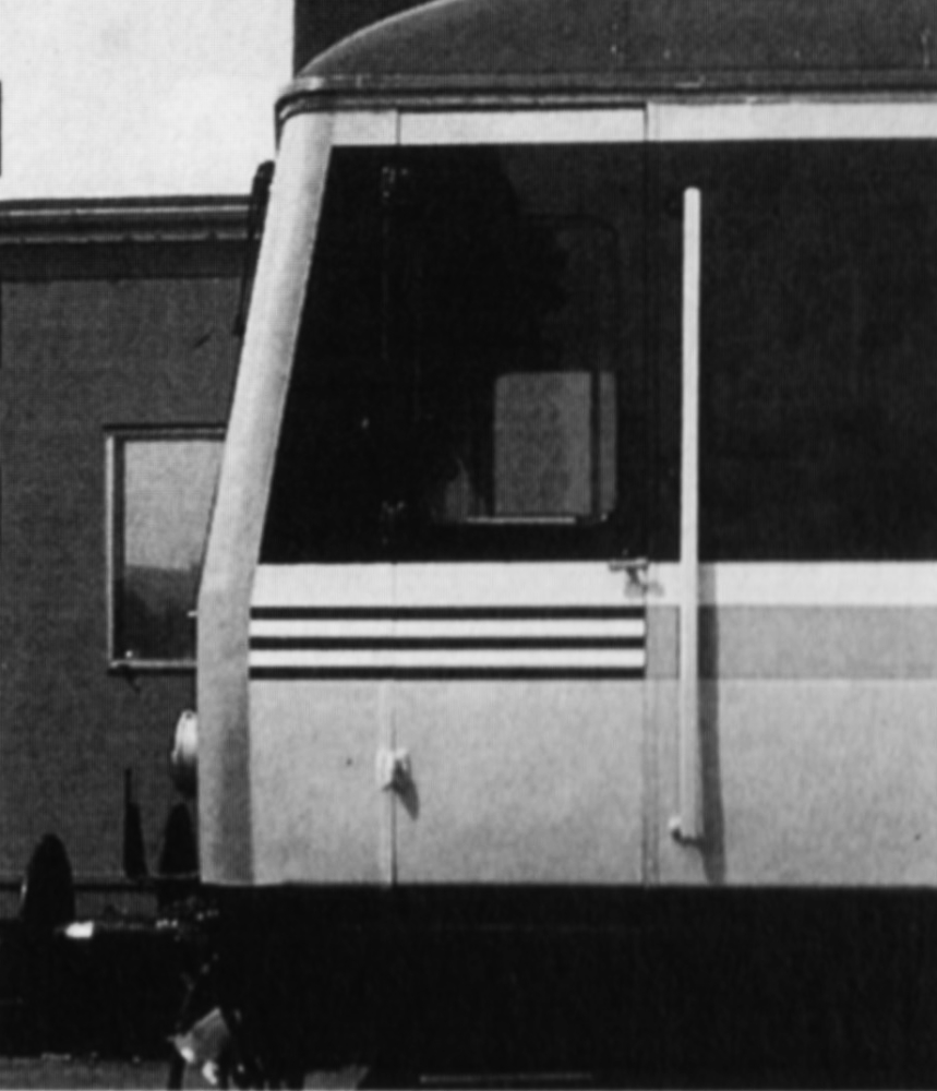
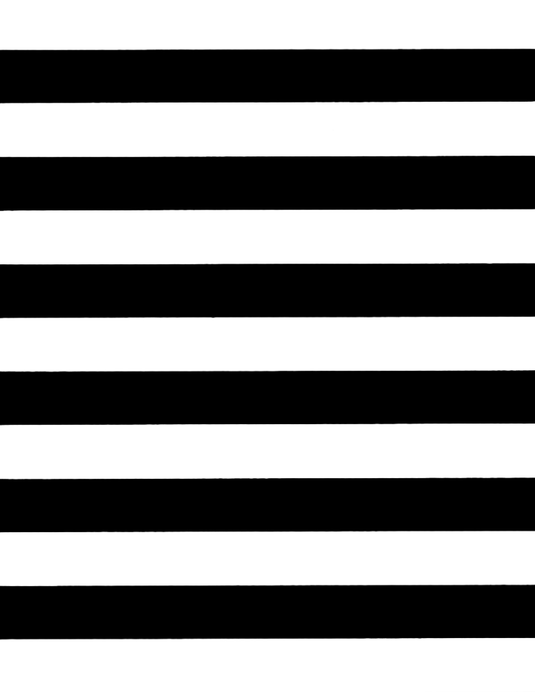
The fleximark (the band of horizontal lines) is an innovation that will, little by little, stamp itself indelibly on the mind of the customer. It is a flexible ‘linking device’ (not a symbol) that will appear everywhere: on the rolling stock, the stationery, the signs and the promotional material. So it is ‘flexible’ in terms of context, and in terms of size and position.
It is, however, deceptive. Like the Regional Railways logotype, it has to be reproduced with absolute accuracy, according to the detailed instructions contained in the Identity Management binder, if it is not to become distorted and thereby lose its character and power.

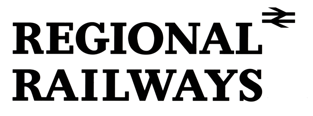
The logotype has
been specifically
drawn and spaced
so must always be
reproduced from
artwork.

One line version
is available where
space does not
permit the use of
the two line
version.
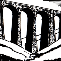
Special designed
devices will be created
to promote particular
lines as products in
their own right. The
image chosen for each
approved line is based
on the most widely-
known feature
associated with the
route. The Settle-
Carlisle Line is one
such approved line
image.
Pantone 299
Pantone 281
Pantone 5455
Pantone 425
The colours
associated with
Regional Railways
are dark blue, dark
grey, silver grey
and light blue

The logotype may
be reproduced in
dark blue, dark
grey, black or white
when reversed out.
When the logotype
is produced in
negative form a
different artwork
must be used
which has been
adjusted to give
the same visual
weight when
reversed out.


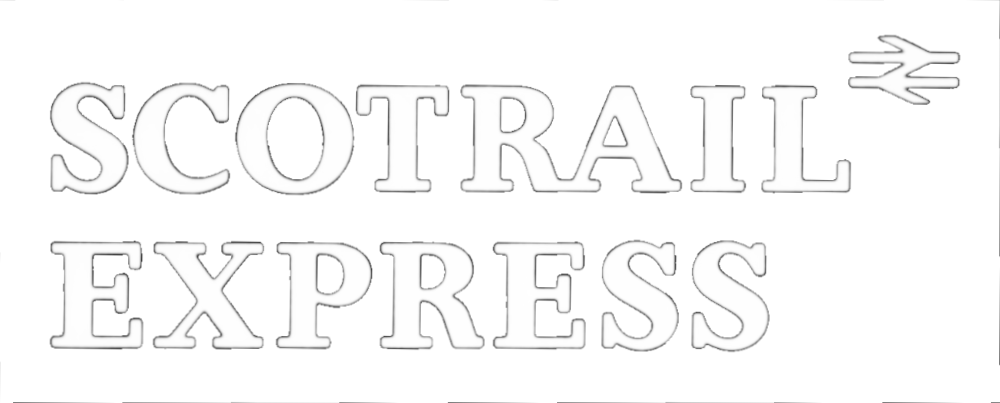
ScotRail Express is
the only named
product which has
its own logotype.
The ‘fleximark’
linking device
used on all
aspects of the
business always
bleeds off to the
left or right.
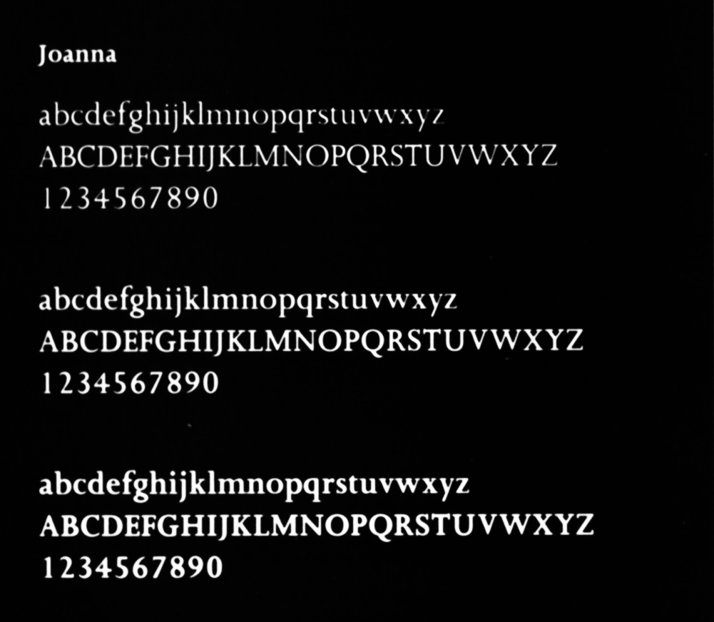
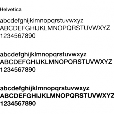
Joanna is the
chosen promotional
typeface for
Regional Railways.
Helvetica is used
for information.

Design elements – a brief summary

Regional Railways logotype
The Regional Railways logotype appears in two formats; the ‘stacked’ version or the ‘one-line’ version. The stacked version should be used wherever possible, with the alternative one-line version used only in situations where space is at a premium or where otherwise specified, as on rolling stock.
To counter the differences caused by optical illusion, separate artwork has been produced for positive and negative applications and also for use at very small sizes on items such as pens. It is important to use the correct artwork for each particular case.
The BR symbol is an integral part of our logotype and the size and positioning is critical. It should always be reproduced in the same colour as the lettering.
ScotRail logotype
This is used instead of the Regional Railways logotype in Scotland. As with the Regional Railways logotype, ScotRail has different artworks for positive and negative applications and for small sizes.
ScotRail Express
The only named product of Regional Railways, ScotRail Express refers to the Class 158 services in Scotland. It has its own logotype which follows the same principles as the Regional Railways version.
Fleximark
In formal usage the Regional Railways linking device appears as horizontal dark blue lines on a white background but, as the name suggests, it is essentially a flexible mark which can appear in different colours, sizes and lengths depending on the application and the creative use of the fleximark on special promotions is positively encouraged.
There are, however, strict guidelines for how to reproduce the fleximark in all cases, including a negative version to compensate for the optical illusion of visual inequality when reversed out of dark colours.
The one inviolate rule is that the fleximark should always abut to the edge of something – as illustrated in this brochure.
House colours
The colours chosen for Regional Railways are dark blue, light blue, white, silver grey and dark grey. The dark blue is the main and most widely used colour, often complemented by silver grey particularly on stationery items like folders. Light blue is generally used as a highlight colour, as on the train livery.
Typefaces
Standard typefaces help to increase awareness of a ‘family likeness’. For promotional print such as posters and leaflets the Joanna typeface has been selected. The need for variety is satisfied by the number of styles available within the typeface.
Informational print encompasses timetables, departure posters and ‘useful information’ posters. To help the customer differentiate between promotion and information the Helvetica family of typefaces has been retained by Regional Railways for informational uses, as it is very easy to read.
Rail Alphabet is the corporate typeface specifically designed for signing and Regional Railways will maintain its usage for that purpose.
Line images
Certain lines have the potential to be promoted as a product in their own right as well as a means for moving passengers from A to B. Line images are the graphic devices used to promote such lines, of which the Settle-Carlisle Line is a perfect example. The image will be based on the most widely-known feature associated with the route and will be produced in a square, ‘woodcut’ style that it suitable for both print and heritage signing applications. An appropriate dark background colour will be selected and, once chosen, this colour will remain an integral part of the line image.
The line image can be used on promotional print, gifts, pocket timetables and heritage signing following the rules laid down in the Identity Management Binder.
Any proposed line image must first be approved by the Director, Planning & Marketing before the design solution is progressed through the Identity Working Group on Print. All subsequent usage must then be approved by the appropriate profit centre Marketing Manager. The image will be copyright Regional Railways.
Contacts
A list of contacts for queries on design elements, and for sources of prints of the artworks for approved purposes, can be found in the Contacts Section at the end of this brochure. General comments and queries about the Identity Strategy should be directed through the nominated profit centre contact or the Identity Manager.