communicating information

communicating information
  • Timetables
  • Departure sheets
  • Maps
  • Destination labels
  • Posters

Regional Railways will maintain the British Rail tradition of using the Helvetica typeface to provide its customers with all essential information. It is exceptionally clear and the travelling public is well used to it.

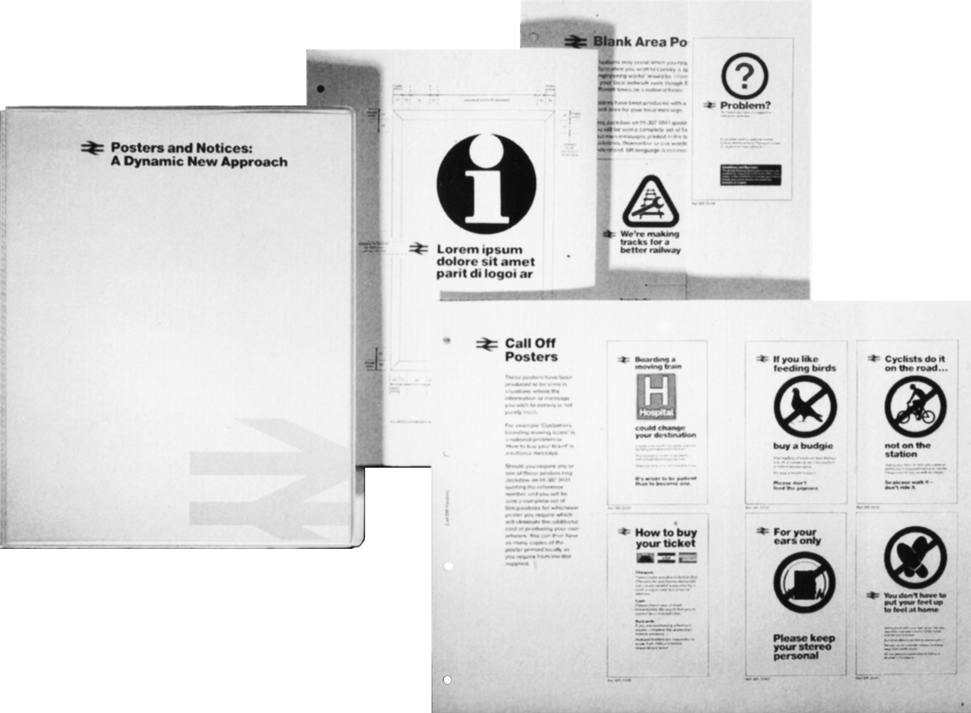
There must be a sharp distinction between information posters and those with a promotional message. The difference must be obvious to the untutored eye. This is one very good reason for using Helvetica to convey information and Joanna to promote ideas. The wording on an information poster also needs to be unambiguous and positive in tone. For example: “As part of our programme to improve the service between X and Y, we shall be undertaking engineering works during the coming six weeks. We regret any inconvenience this may cause” rather than “We regret that due to engineering work, services between X and Y will be disrupted for the next six weeks”. A separate binder on corporate information posters has been produced to help standardise and improve messages to our customers.

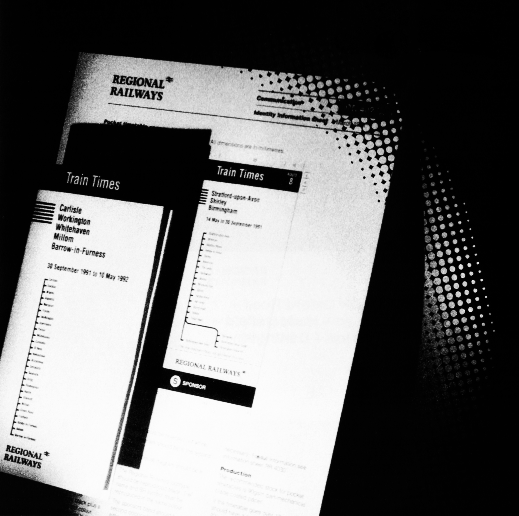
A thorough research programme has shown that the great majority of the public prefers a timetable in the form of a booklet with a stapled spine, showing the particular route in linear form on the cover. The Regional Railways pocket timetable will follow that format throughout the network. There is a marked similarity to the InterCity timetable and that is to our mutual advantage since customers will be at ease with both. There are also options for network guides and route cards. There will be two kinds of departure posters, the familiar A-Z listing that is posted at all big stations and the line-of-route departure sheet which will be posted at all the stations along that particular route

The printed destination panels applied to the windows of the rolling stock are an essential part of the process of reassuring travellers. The design, printing and application of these items alone justify a number of information sheets within the Identity Management binder to cope with advice on short platforms, request stops and coach identification, as well as an adapted design for plug-door stock such as the new Class 158.

Maps are essential. There are two types: one to be displayed on the stations in the information structure and another to be posted inside the carriages within specially designed frames. There is a special format for each type to make sure that the style, headings and use of branding as an endorsement is consistent. This is an organisation that is coherent and systematic in its approach to every facet of its operation.

communicating information – publications

Destination label - Norwich

A separate
publication gives
details about how
to get hold of, or
produce corporate
information posters
and how to cope
with emergency
notices.

Publications
Destination label - Newcastle

Destination labels
have been carefully
designed to give
maximum legibility
for the information.
They can also
incorporate
request stops and
short platform
advice.

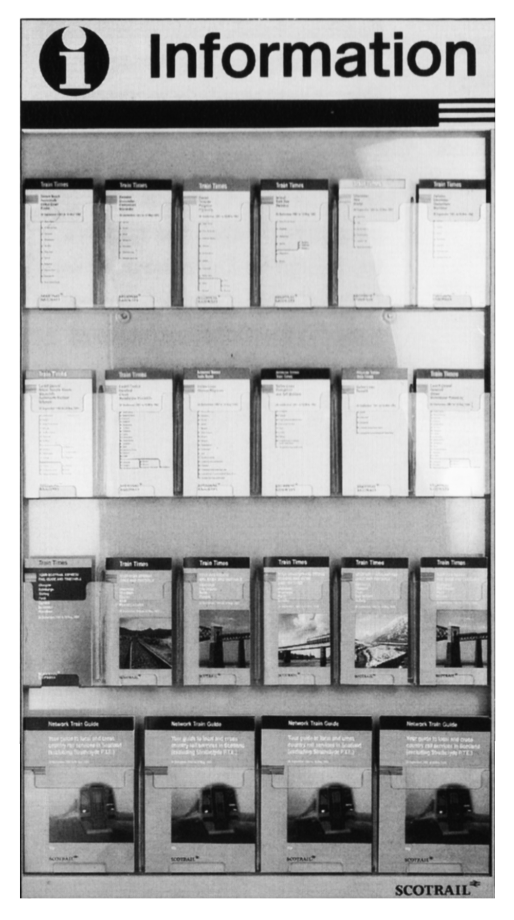
Leaflet rack


Regional Railways
and ScotRail
timetables
displayed in the
specially designed
leaflet rack. Shown
here are examples
of pocket 
timetables and
network guides in
the strong
house style. Route
cards will also be
available.


The new format of
pocket timetable
was chosen after
national research
and feedback from
all parts of the
business. It
incorporates
customer-driven
improvements
such as simple
tables and notes
on every page.

Pocket timetable
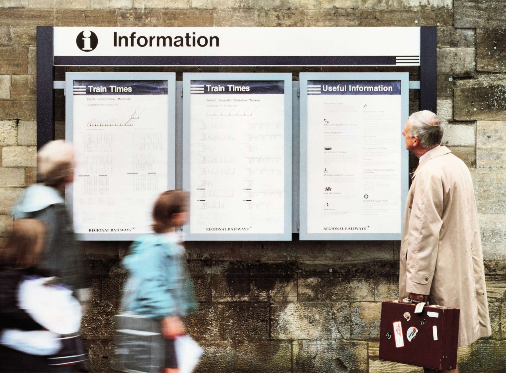
Information posters


A modular
information
structure has been
specially designed
to take departure
sheets, maps and
other useful
information. All
informational print
uses the helvetica
typeface for clarity.

Communication policy for information – a brief summary

Communications policy for information – a brief summary

Typefaces

Helvetica has been retained as the approved typeface for all informational print, particularly as the typeface is easy to read from a distance.

Timetables

As a result of a programme of national research carried out on behalf of Regional Railways, certain fundamental customer requirements have been identified with regard to timetables; notes on every page, simple table styles, timetables looking like information rather than promotions, stapled booklets, inclusion of a route diagram and/or network map, black on white copy. All have been incorporated into the new format which is consistent throughout Regional Railways.

There are three pocket timetable formats: line of route, region guides and particular service guides such as ScotRail Express. The covers of all feature the strong family style. The inside format, as well as the covers, has been designed to reflect the customers’ requirements.

Line of route pocket timetables are the simplest of the formats. They generally carry information relating to one main route and its spurs. Region guides provide information relating to a group of lines in one area, while the ScotRail Express leaflets give details of all the 158 services in Scotland.

Network guides and route cards are also available and follow the same ‘family’ guidelines. The network guides cover coherent local networks such as the North West while, at the other end of the scale, route cards give the simplest information relating to journeys between two or three stations only.

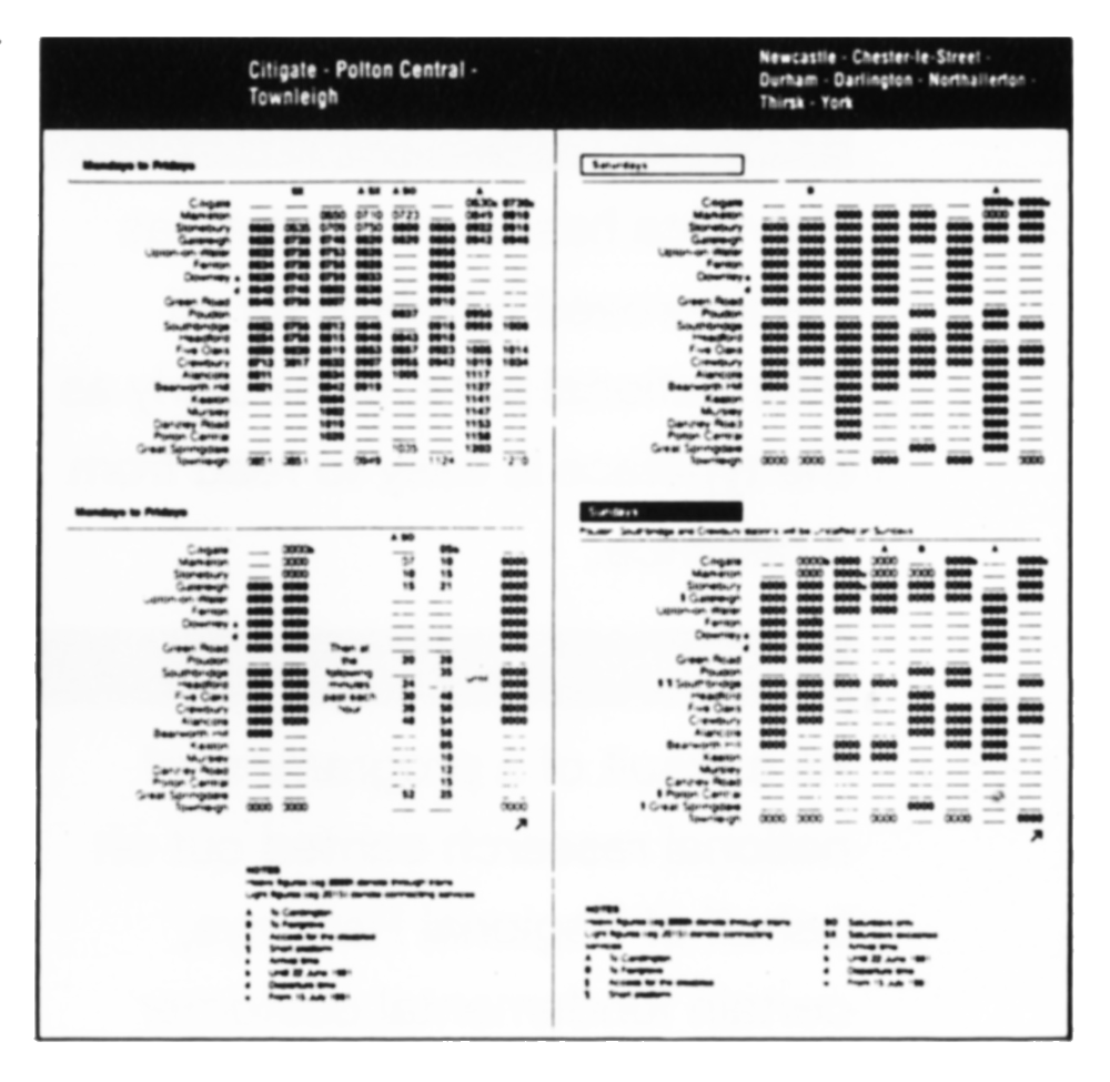
Departure sheets

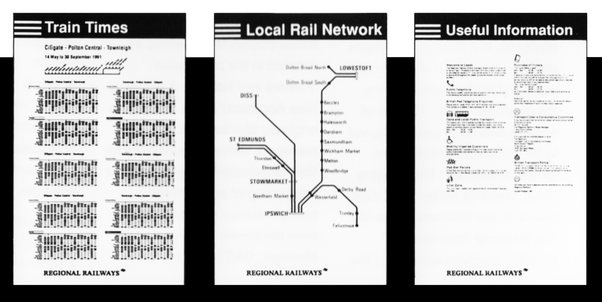
There are two types of poster: corporate A-Z listings at all major stations, and line of route sheets posted at all the stations along the particular route. The line of route sheets have been designed to be consistent with the new format timetables. The heading ‘Train Times’ is white out of dark blue with the fleximark to the left. The Regional Railways or ScotRail logotype appears at the bottom, with other major sponsor’s mark if appropriate.

Information posters

A specific ‘Useful Information’ poster has been designed to complement and be posted next to departure sheets. This features the heading in a dark blue band with the fleximark to the left and Regional Railways or ScotRail branding at the bottom. The information contained in these posters relates to either a specific line of route or can be tailored to specific stations and includes such subjects as local public transport and taxis, public telephone positions, Red Star parcel facilities and the address of the Transport User’s Consultative Committee.

Other information posters should follow corporate guidelines as detailed in the publication ‘Posters and Notices: A Dynamic New Approach’. This binder was originally distributed to all managers with a responsibility for the commissioning, production or positioning of such printed matter. Advice may be obtained from the Senior Creative Manager, CAS London.

Destination labels

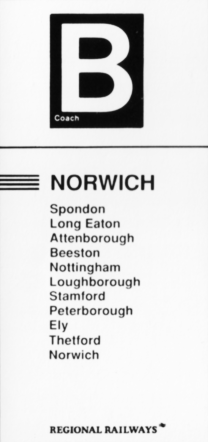
The labels feature the fleximark, Regional Railways, ScotRail or ScotRail Express logotype, the destination and a list of calling points. Important factors such as short platforms or request stops can also be highlighted and coach identification added as necessary. Information sheets covering all permutations can be found in the Identity Management binder.

Maps

There is a format for single size (Double Royal) and double size (Quad Royal) map posters for use on stations. The heading is in white on a dark blue band with the fleximark on the left. Regional Railways or ScotRail branding, and a sponsor’s mark where appropriate, is featured at the bottom. The format has been specially designed to give the maximum area for map information. All map information is required to be in the standard style, contact Senior Advertising Manager, London for details.

There will also be a range of network maps for use within the standard frames on trains.

Contact the Design Manager for details.

Working group

The Identity Working Group on Print meets regularly to assess, approve and review the application of identity on print, ratify the use of national campaign devices and approve the design for line images. A list of the current members can be found in the Contacts pages at the back of this brochure.

1992 // THIS IS TRANSDIFFUSION