
promoting business

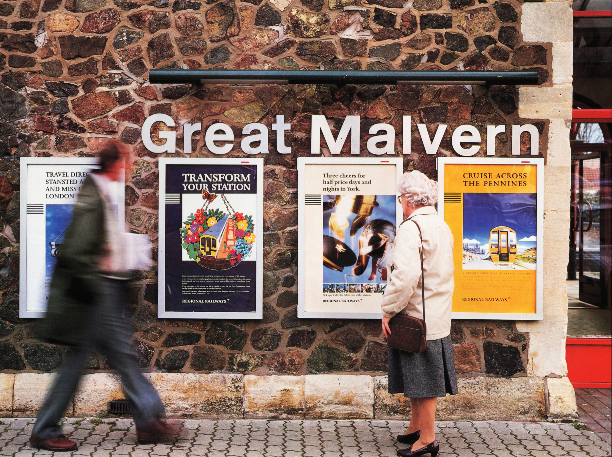
Great Malvern station
promoting business
  • Posters
  • Promotional leaflets
  • Campaigns
  • Special promotions
  • House style

Every profit centre within Regional Railways and every one of the Passenger Transport Executives is striving to provide a service of quality. And every one has something special to contribute to the whole. A little of the excellence of one offer can easily rub off onto another, to everyone’s advantage, as long as each of them is recognisably part of the whole. In other words, customers who have thoroughly enjoyed a ride on the Settle to Carlisle line and who then recognise another piece of literature from the same ‘stable’, promoting some other kind of offer, are much more likely to respond positively.

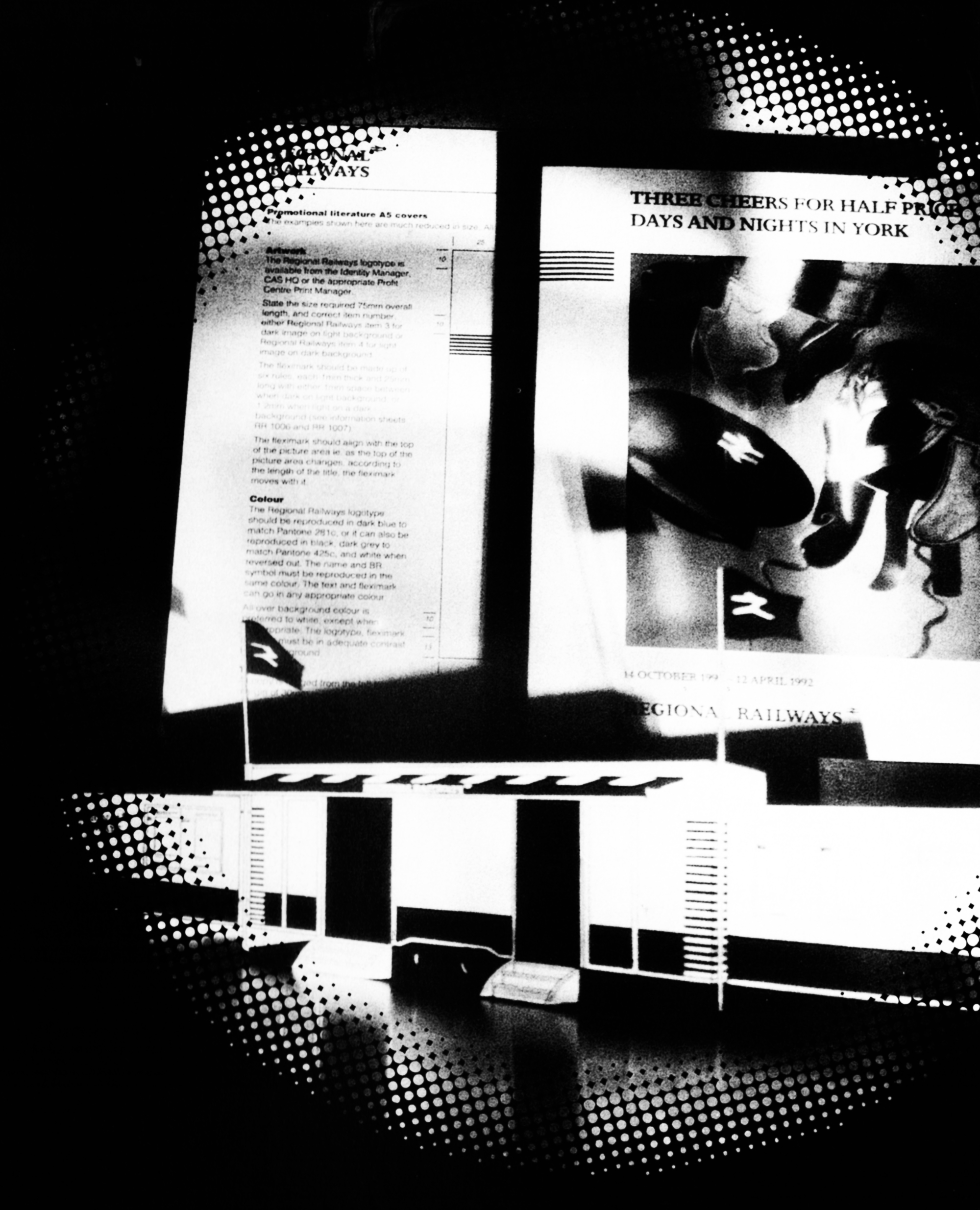
For this reason, the corporate identity has laid down a format for the production of promotional literature and posters. The public response, according to thorough research, has been favourable. The grid allows for bright colours so that the leaflets stand out amongst the competition. The grid ensures that the offer is placed prominently at the top with Regional Railways branding as an endorsement at the bottom. The fleximark will, as always, provide the principal Regional Railways family characteristic.

The very fact that Regional Railways is to be promoted at all is in itself an innovation and it will be done on 48-sheet posters, in newspaper advertisements and on television.

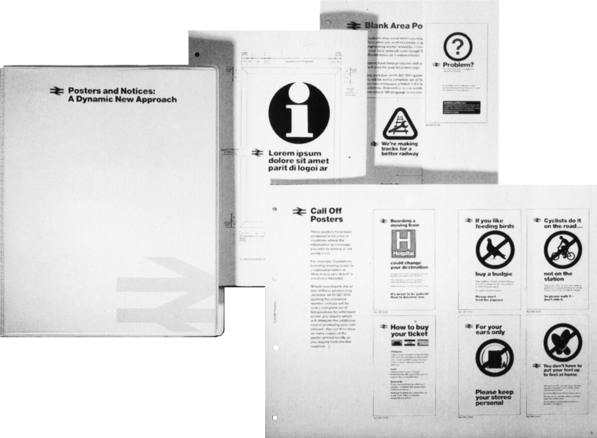
The information sheets contained in the Identity Management binder will spell out all the essentials to enable promotional print to be designed according to the grid. Even so. there will be briefings and follow-up sessions to ensure that everyone who is actively involved is confident about what they are doing and happy with the results.
communicating information

communicating information
  • Timetables
  • Departure sheets
  • Maps
  • Destination labels
  • Posters

Regional Railways will maintain the British Rail tradition of using the Helvetica typeface to provide its customers with all essential information. It is exceptionally clear and the travelling public is well used to it.

There must be a sharp distinction between information posters and those with a promotional message. The difference must be obvious to the untutored eye. This is one very good reason for using Helvetica to convey information and Joanna to promote ideas. The wording on an information poster also needs to be unambiguous and positive in tone. For example: “As part of our programme to improve the service between X and Y, we shall be undertaking engineering works during the coming six weeks. We regret any inconvenience this may cause” rather than “We regret that due to engineering work, services between X and Y will be disrupted for the next six weeks”. A separate binder on corporate information posters has been produced to help standardise and improve messages to our customers.

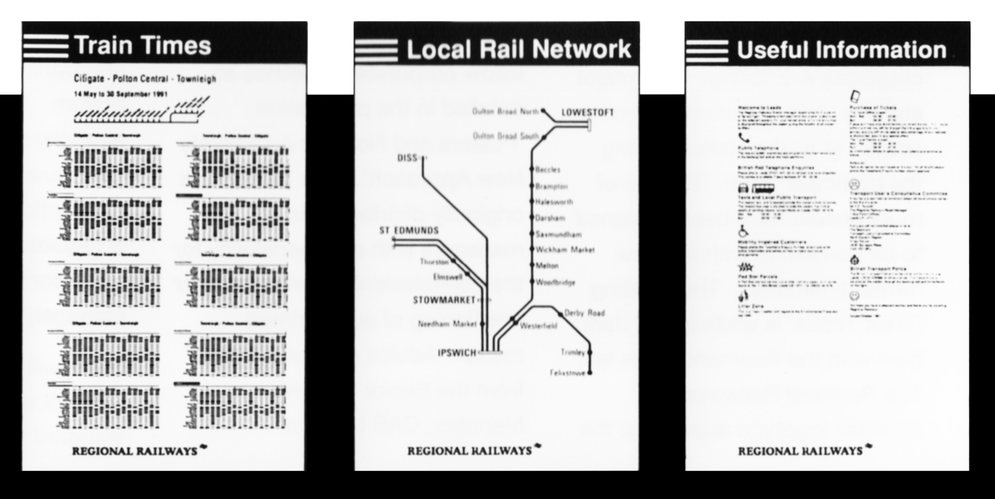
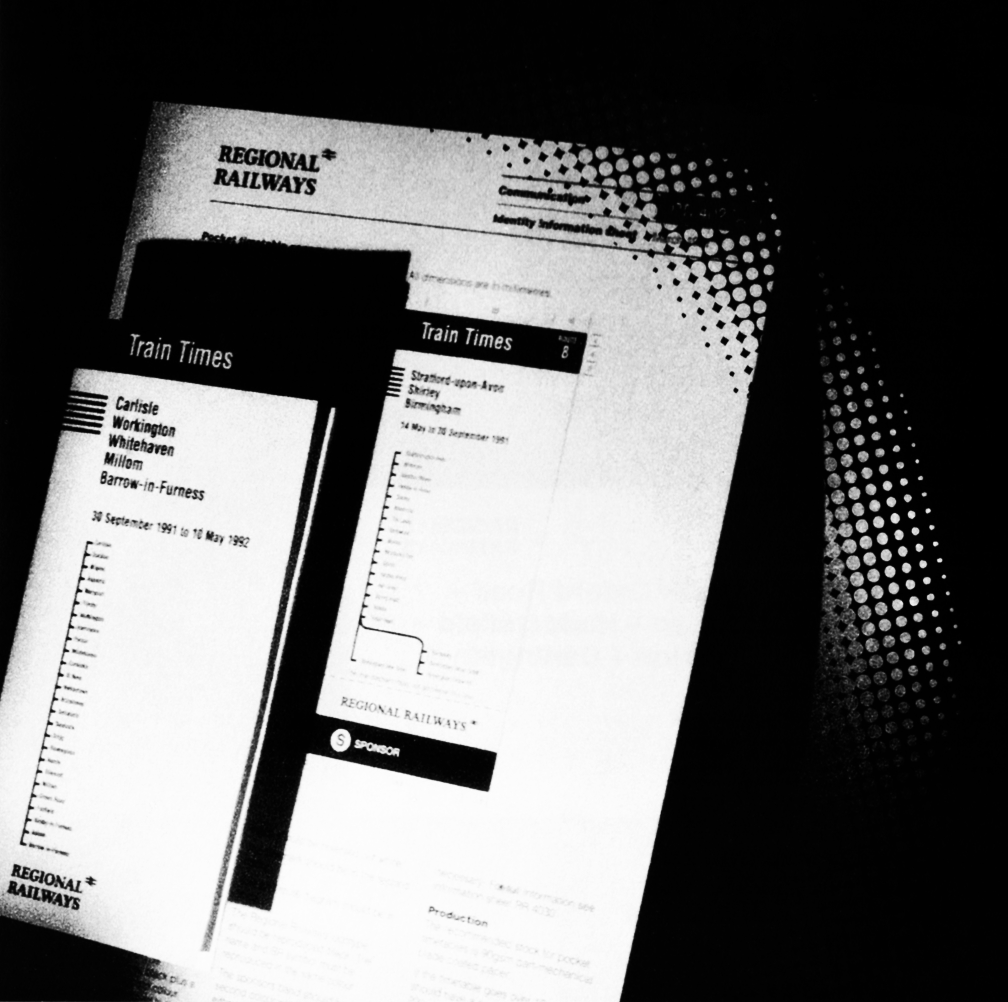
A thorough research programme has shown that the great majority of the public prefers a timetable in the form of a booklet with a stapled spine, showing the particular route in linear form on the cover. The Regional Railways pocket timetable will follow that format throughout the network. There is a marked similarity to the InterCity timetable and that is to our mutual advantage since customers will be at ease with both. There are also options for network guides and route cards. There will be two kinds of departure posters, the familiar A-Z listing that is posted at all big stations and the line-of-route departure sheet which will be posted at all the stations along that particular route

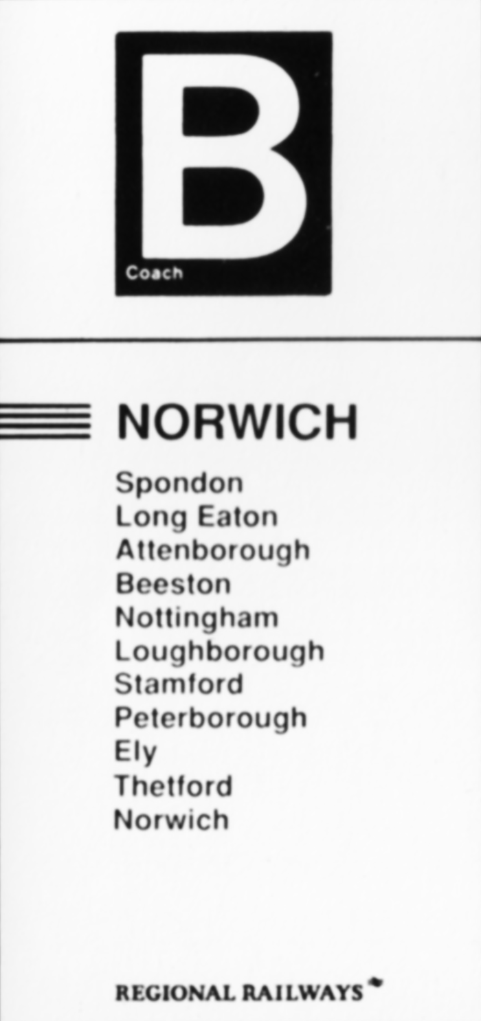
The printed destination panels applied to the windows of the rolling stock are an essential part of the process of reassuring travellers. The design, printing and application of these items alone justify a number of information sheets within the Identity Management binder to cope with advice on short platforms, request stops and coach identification, as well as an adapted design for plug-door stock such as the new Class 158.

Maps are essential. There are two types: one to be displayed on the stations in the information structure and another to be posted inside the carriages within specially designed frames. There is a special format for each type to make sure that the style, headings and use of branding as an endorsement is consistent. This is an organisation that is coherent and systematic in its approach to every facet of its operation.

communicating information – publications

Destination label - Norwich

A separate
publication gives
details about how
to get hold of, or
produce corporate
information posters
and how to cope
with emergency
notices.

Publications
Destination label - Newcastle

Destination labels
have been carefully
designed to give
maximum legibility
for the information.
They can also
incorporate
request stops and
short platform
advice.

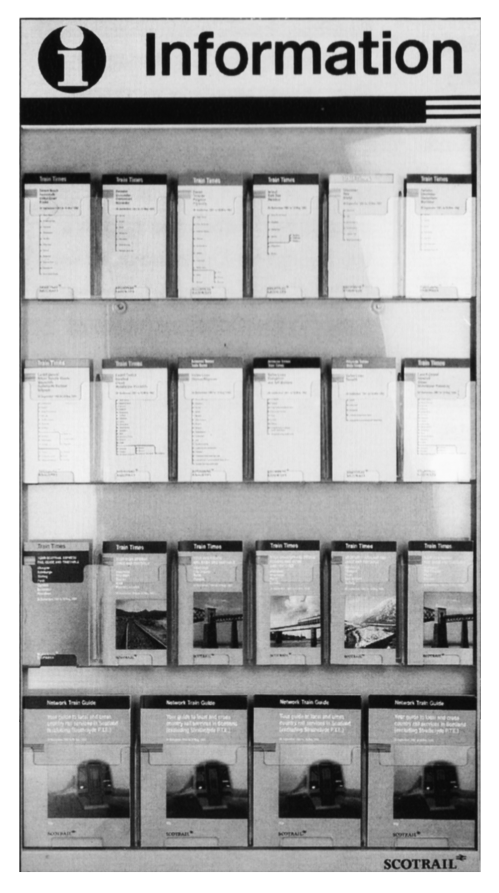
Leaflet rack


Regional Railways
and ScotRail
timetables
displayed in the
specially designed
leaflet rack. Shown
here are examples
of pocket 
timetables and
network guides in
the strong
house style. Route
cards will also be
available.


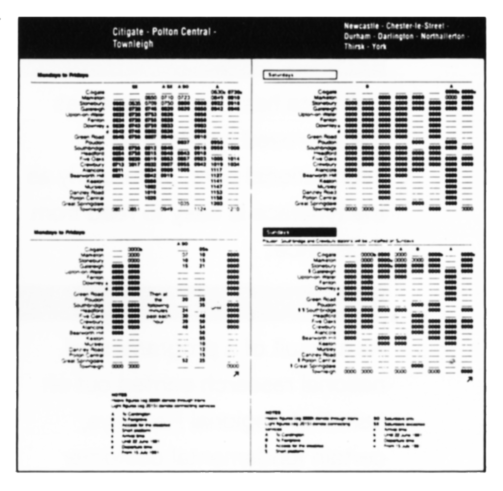
The new format of
pocket timetable
was chosen after
national research
and feedback from
all parts of the
business. It
incorporates
customer-driven
improvements
such as simple
tables and notes
on every page.

Pocket timetable
Information posters


A modular
information
structure has been
specially designed
to take departure
sheets, maps and
other useful
information. All
informational print
uses the helvetica
typeface for clarity.

1992 // THIS IS TRANSDIFFUSION