
- Station furniture
- Design details
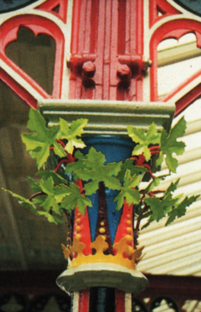
- Environment
- Colour palette
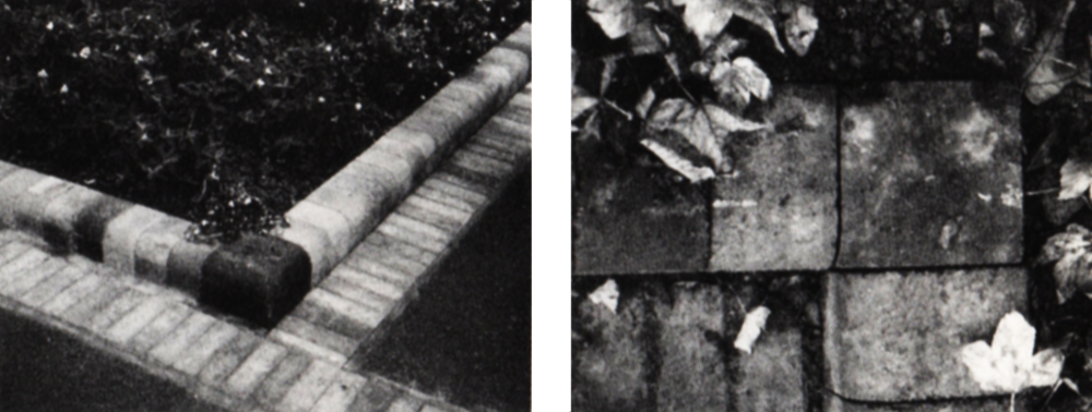
- Surfaces
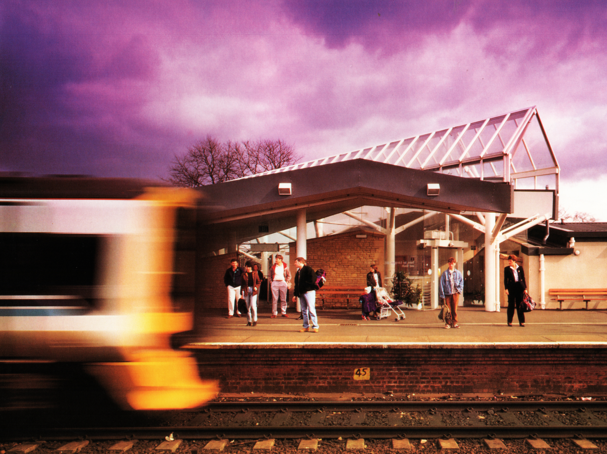
There are more than 1400 Regional Railways stations. The variety is enormous. So is the context in which they are set. There are major terminii in urban settings, local halts in the wildest countryside and everything in between. For this reason the new corporate identity was designed to add to the best characteristics of a particular locale with discretion, not to impose itself brashly as if applying a red hot branding iron. The aim is to encourage passengers and staff with regional allegiances to think in terms of ‘my station, in the care of Regional Railways’, not ‘my locality, taken over lock, stock and barrel by Regional Railways’.
The key phrase here is ‘in the care of’. No amount of tasteful paintwork makes up for malfunctioning lavatories, litter-strewn platforms, broken windows in unheated waiting rooms, potholes in the forecourt and misleading sign systems. The travelling public does not make huge demands of the average station. It is well within our powers to meet all their demands fully and consistently. Bad impressions last. Creating a good impression through attention to this kind of detail is an absolute essential of a successful corporate identity. To maintain the impression is to create new business.
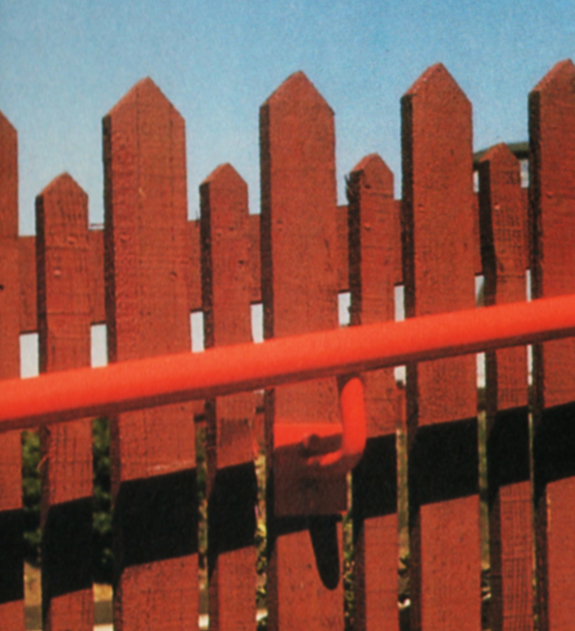
There is a special group of colours to be used on Regional Railways stations, not just the brand shades of blue and grey. This environmental colour palette can be used to bring out the best in any station. The Identity Management binder contains guidance on how to use the colours – whether for large areas, or as highlights, or for specific purposes. Many of our stations will deserve colour schedules specifically drawn up by your profit centre architect.
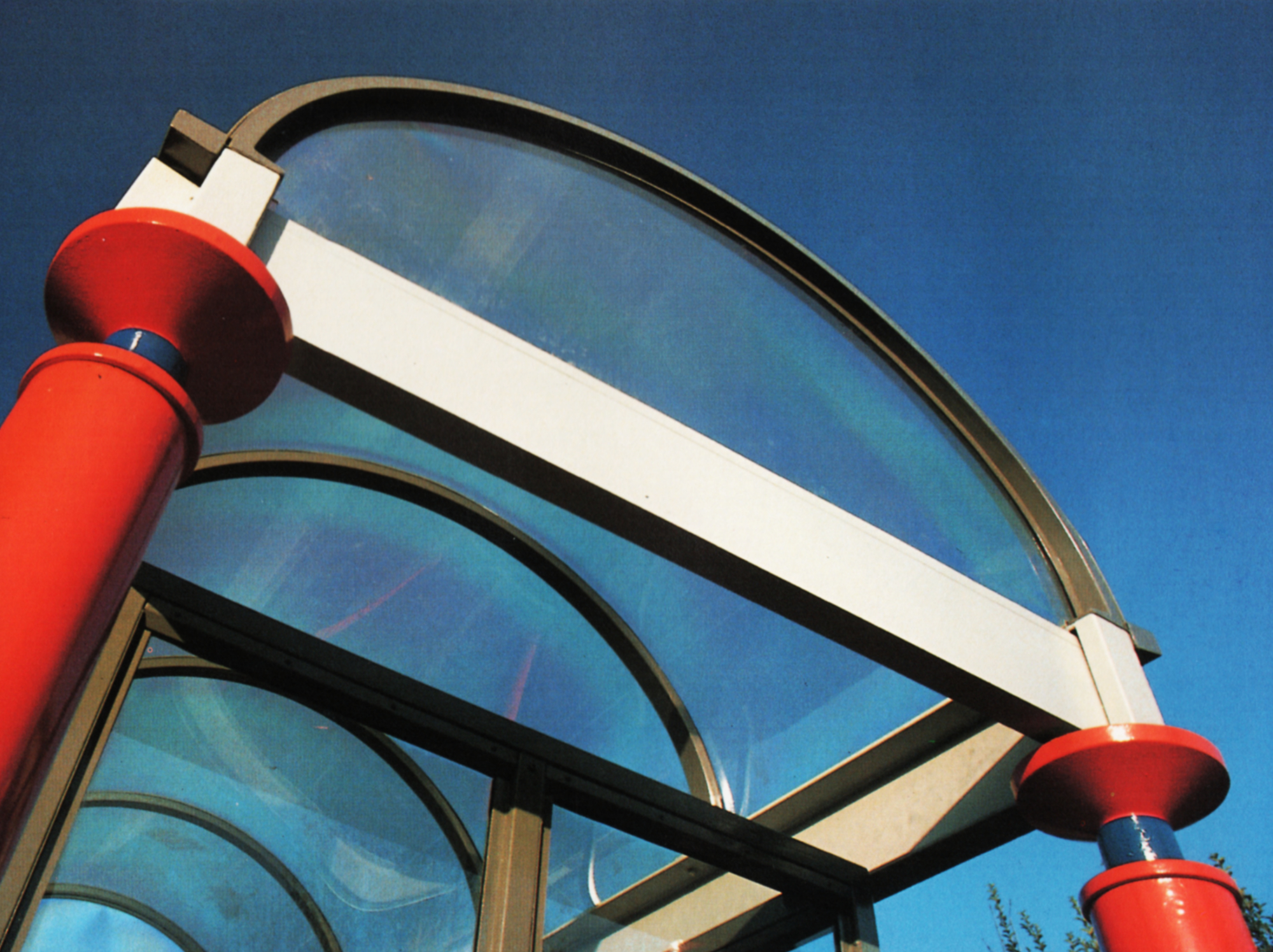
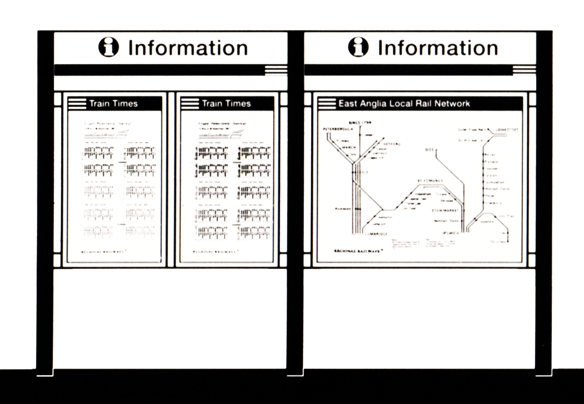
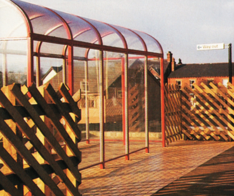
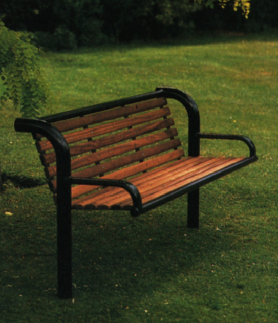
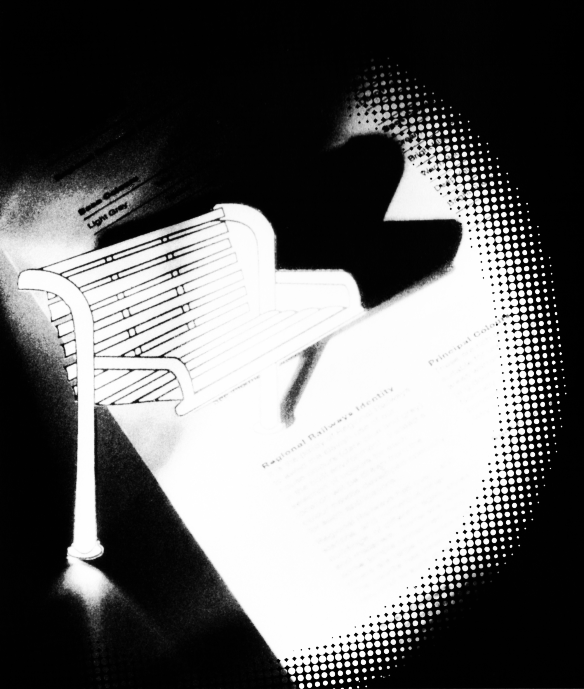
A relatively small range of station furniture will be available, some of it specially designed and made. It will include waiting shelters, seating, litter bins and lighting. We recognise that it is not easy to furnish a station functionally and make it look good and remain within a strict budget. So we recommend that managers ask their architect for advice. He or she will also advise on the adaptation, refurbishment and renewal of buildings and the built environment, including fencing, pavings and planting.